GraphPolaris uses a consistent color system throughout the Explorer interface to help you quickly identify and distinguish between different types of graph elements.
Core Color Philosophy
The color system is built on a simple but powerful principle:
🔥 Orange/Warm colors represent entities (nodes)
❄️ Blue/Cold colors represent relationships (edges)
This color distinction is applied consistently across all visualizations, UI elements, and interactive components in the Explorer.
Pill Colors
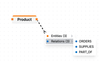
Both in the schema panel as the query builder, we use pills to represent entities. These pills are are orange when they represent entities, and blue when they represent relationships.

In other parts of the interface, we refer to entities and relations with a colored dot like in:
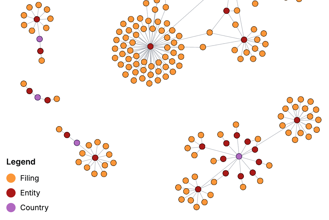
Visualization Colors
In the visualization we show the result of a query that can contain multiple types of entities (e.g., Person ánd Product). To distinguish between these, the system uses two 9-color categorical color palettes, a warm set for entities and a cold set for relationships. You can always consult the legend in the bottom left of the visualization panel to reference the colors for each node.
We apply the colors based on which nodes are present in the result set, because we cannot guarantee sufficient contrast between colors when the schema of a dataset is large. This means that a certain entity may not always have the same color.
| Type | Colors |
|---|---|
| Entities |
|
| Relationships |
|
For example:
Using Colors in Your Analysis
When exploring your graph data:
- Look for warm colors to identify different entity types
- Look for cool colors to identify different relationship types
- Use color patterns to spot clusters of similar entities or relationships
- Leverage the contrast between warm and cool to understand the structure of your graph
The consistent use of color throughout GraphPolaris makes it easier to navigate complex graphs and understand the relationships between different types of data.